Art Appreciation Through the Eyes of a Beer Geek
Art Appreciation Through the Eyes of a Beer Geek
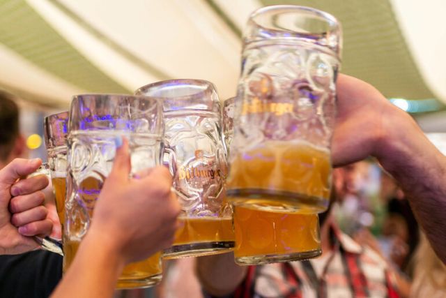
As much as beer geeks might disagree, a beer’s label plays a part, although somewhat small, in their choosing a bottle to grab off the shelf. For the average shopper, though, an eye-grabbing label can make or break a purchase decision.
Whether it’s a cute cartoon character, bright colors, bold graphics, or anything that strikes an instant visual connection, beer label art can actually affect the psyche to enhance your enjoyment of a beer and your appreciation of the brewery. Or, in some cases, it can achieve the exact opposite effect.
Below are just a few of the beer labels from the Chicagoland region that dazzled my eyes over the years. Disclaimer: As with all forms of artistic expression, including our beloved beer, the appreciation of beer labels is completely subjective. The list below comprises the impressions of the author only.

Odd Side Ales Morningwood Stout – Choosing a favorite label from this Grand Haven, Michigan, brewery is almost as arduous as picking a favorite beer of theirs. Like all of Odd Side’s painted labels, Morningwood Stout’s deep, rich colors and gallery-worthy atmospherics not only command your attention but also perfectly match the essence of the beer inside the bottle.

Une Année (all labels) – Akin to the name of its session saison, Less is More, this Chicago brewery deftly proves that you don’t need cartoonish characters, bold colors, or gimmicks to catch a shelf surfer’s eye. Founder Jerry Nelson, an architect by day and enthusiast of clean, modern design, enlisted Zimmer-Design to create Une Année’s branding from the ground up with a focus on minimalism. This clean, simple, and professional approach evokes a sense of stature and credibility well beyond this upstart’s years.

Pipeworks Abduction Series – Being a firm believer in giving credit where credit’s due, I’m a huge fan of Pipeworks’ Abduction Series of stouts (Imperial, Coffee, Toasty Nut, Raspberry Truffle, Orange Truffle, and Cherry Truffle), which has featured one of their employees on each of the labels. How cool is that? Good luck finding a cool perk like that at your job.
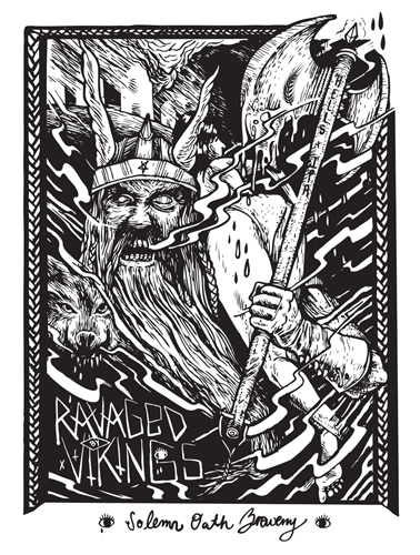
Solemn Oath Ravaged By Vikings – A suburban brewery with an urban attitude, Solemn Oath has taken carefully measured steps with its image and branding since Day One. Its recent foray into bottled beers is no exception, as artist Jourdon Gullett has created intricately illustrated labels that perfectly capture the beers’ monikers. The first of its bottle labels, Ravaged By Vikings may strike fear into the hearts of some landlubbers, but it gives fair warning of this double IPA’s strike.
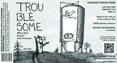
Off Color Troublesome – If eccentric film director Wes Anderson designed beer labels, he’d probably work for Chicago’s new Off Color Brewing. Its labels, inspired by the mice that feast on the brewery’s grain bags, each depict a furry friend’s adventure and use a rough sketch aesthetic. With Troublesome’s label, I imagine this little guy on the verge of discovering a lifetime’s supply of malts after a long, treacherous journey through the streets and alleys of Chicago.
The last two beer labels are neither new nor foreign to any beer lover, but I couldn’t leave them off the list.

Bell’s Hopslam – When you’re strolling down the beer aisle and you see that once-in-a-year green color sitting on the shelf – somewhere between split pea soup and pistachio cake frosting – you instantly know Hopslam is back…and won’t be available for long. In addition to its unique package color, Hopslam’s light-hearted graphic perfectly portrays the overwhelming hoppiness packed into each bottle.

Goose Island Bourbon County Brand Stout 2013 Series – Since moving to the current design template a few years ago, the labels for Goose Island’s BCBS Series carry with them a deserved air of accomplishment, dignity, and bravado. There’s nothing flashy about them – a touch of bright foil here and a splash of color there (more so this year to distinguish the variants). In fact, the label looks almost like a certificate of honor wrapped around the bottle – like you’re about to open and enjoy an award winner. And trust me, you are.
About the Author: American Craft Beer
Get Social


Join Our Newsletter