
 We care about craft beer label art a lot at American Craft Beer.com. We care about it so much that we’ve even made it part of how we rate craft beers here. Labels are the unsung heroes of the drinking world; they lure in customers who don’t necessarily know what a saison or a stout is, beckoning with their bright colors, sharp designs, and bold graphics. We’ve got some great local talent slapping noteworthy art on bottles, which begs the question: who’s behind these masterpieces?
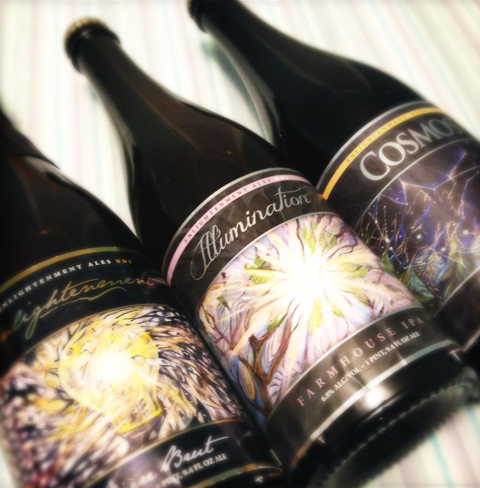
Known for its Bière de Champagne offerings named after harmony and space, Enlightenment Ales has the trippy, celestial artwork down pat. The labels begin life as paintings dreamed up by Massachusetts College of Art graduate Liz Jacobs, a close friend and former co-worker of brewer Ben Howe. Their collaborative process is simple: Ben tees up the name and concept for his sparkling creations, the two meet over some beers to brainstorm (aiming for “classy meets psychedelic”), and a few sketches later, the magic starts.
Enlightenment is a shining example of what a harmonious artist-brewer partnership looks like. Shafts of sunlight pierce through tree branches on the Illumination farmhouse IPA, full of intense flavor from American dry hops, while all-knowing eyeballs surround a brilliant light bulb on the bubbly Brut. Swirling pastels adorn the sunny Rite of Spring Saison, full of honey and flower notes – while in contrast, a dark night sky full of soothing stars decorates the rich, deep Cosmos stout. The effect is sheer beer nirvana.
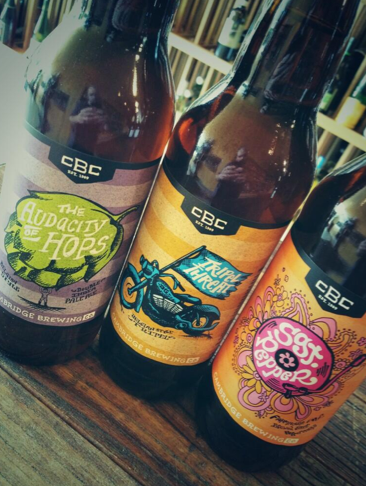 Switching from mystic to stylistic, Cambridge Brewing Company bottles are immediately recognizable due to subtle striping, bright colors, and cartoonish graphics. A team of three freelance designers – Will Thomas, Bryant Ross, and Peter Strut – handles the task of matching the ingredients and story behind a beer to its outward appearance through a free association session with CBC brewmaster Will Meyers and owner Phil Bannatyne. Three proposals are made, one is picked, and the refining process begins.
Phil explained to me that the labels are designed to look great in a series, and I agree – when you see the teal blue and crisp orange of the Great Pumpkin Ale alongside the purple and light green of the Audacity of Hops or the punchy pink of Sgt. Pepper, the hues really do complement each other. The splashy fonts always seem to pop on the shelf, reminding me of doodles I used to draw in algebra class – and similar to high school, this beer is the life of the party.