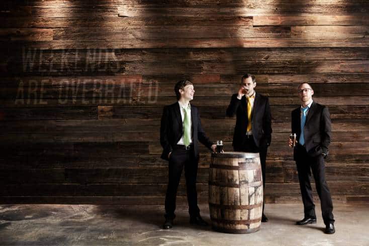
Monday Night Brewing founders – Jeff Heck (l), Joe Iverson and Jonathan Baker (r)

(Say goodbye)
It’s easy to make light of brewery rebrandings, but they point to many things. Most breweries that adopt new logos have been around a while. So they certainly deserve props for their sheer survival which doesn’t happen without brewing beer that matters and honing some decent business skills.
Atlanta-headquartered Monday Night Brewing has those attributes in spades. And their recent announcement, that the brewery was adopting a new logo, speaks their intention to stay nimble and relevant in an era of more craft beer competition than ever before.
And Co-Founder, Jonathan Baker, details the why…
“We have realized over the past couple years that change has happened to us and around us since our start in 2011. For one, the industry has changed. When we launched, the “successful brewery playbook” dictated that you must make 3 beers and 3 beers only. A dark beer, a wheat beer, and an IPA. So that’s what we did. Now, a brewery can decide they only want to sell craft lagers… or IPAs… actually, what even is an IPA anymore?”
We’re now over 11 years old. When we started out, we were one of just 3 breweries in the city of Atlanta. Now, we’re one of dozens. We’re also part of a much larger, more vibrant ecosystem of craft breweries internationally.
But we aren’t rebranding just because the industry has changed. More importantly, we have changed. We have grown as people, grown in our knowledge, and grown as a brand. We just happen to be the most award winningest brewery in Southeast, and that isn’t by accident.
Our original logo has served us well. It’s actually a silhouette of my business partner, Joel. We were all working white collar day jobs, wearing neckties to work, making beer for our friends and family. But it’s time to “get out of the menswear business” as our design partners at Matchstic so eloquently put it.”

(Monday Night’s new logo)
Business and marketing is always at the core of any rebranding effort. Monday Night Brewing wants to stay successful and with more than 9,500 craft breweries online in the US who can blame them?
According to co-founder Jonathan Baker, here are more reasons the team is excited about the rebrand:
- It exudes craftsmanship and quality. The hand-drawn word mark is both intentional and human. We pride ourselves in our craft, and this feels more “craft” than our old logo, while still being quirky enough to be fun.
- It is forward looking. The slight forward slant of this logo connotes our desire to always strive for better.
- It promotes inclusiveness. This logo feels more inclusive than our necktie-wearing gentleman (no offense to Joel). We want everyone’s first interaction with our brand to make them feel like this is a craft beer for them, and we realize that such a strong “white collar male vibe” could be masking our true heart for people.
- It points to the beer, not the brand. This is an uncomplicated logo, and that’s intentional. We want the real focus to be on our beers. Simplifying our logo gives us license to give each beer more of a personality.

(Courtesy Monday Night Brewing)
Change is never easy, “Baker added…
“As the guy who brought the necktie-loving brand into existence, this is especially hard for me. But the more I have thought about it, the more I am convinced that our logo and look needs to do a better job representing who we are as a company and how incredibly amazing our beer is.”
###
(All image credits: Monday Night Brewing)
 American Craft Beer The Best Craft Beer, Breweries, Bars, Brewpubs, Beer Stores, And Restaurants Serving Serious Beer.
