 A beer label’s look is important. It’s doorway into the drinking experience that’s both a reflection on and an invitation to the brewer’s art. And here are some of our favorite craft beer label’s from 2016.
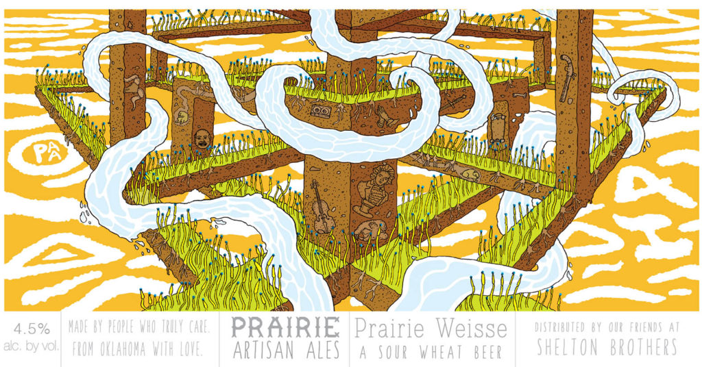
Prairie Artisan Ales Prairie Weisse.
Picking a favorite label from Prairie Artisan Ales is always difficult because they’re all pretty incredible. Designed by Colin Healy, who started the Oklahoma brewery with his brother Chase, The Prairie Weiss label takes its lead from America’s graphic comic tradition and soars into the mythical. The colors are great…the vision trippy.
These guys should publish a hardcover coffee-table art book showcasing all their work – We’d buy it!
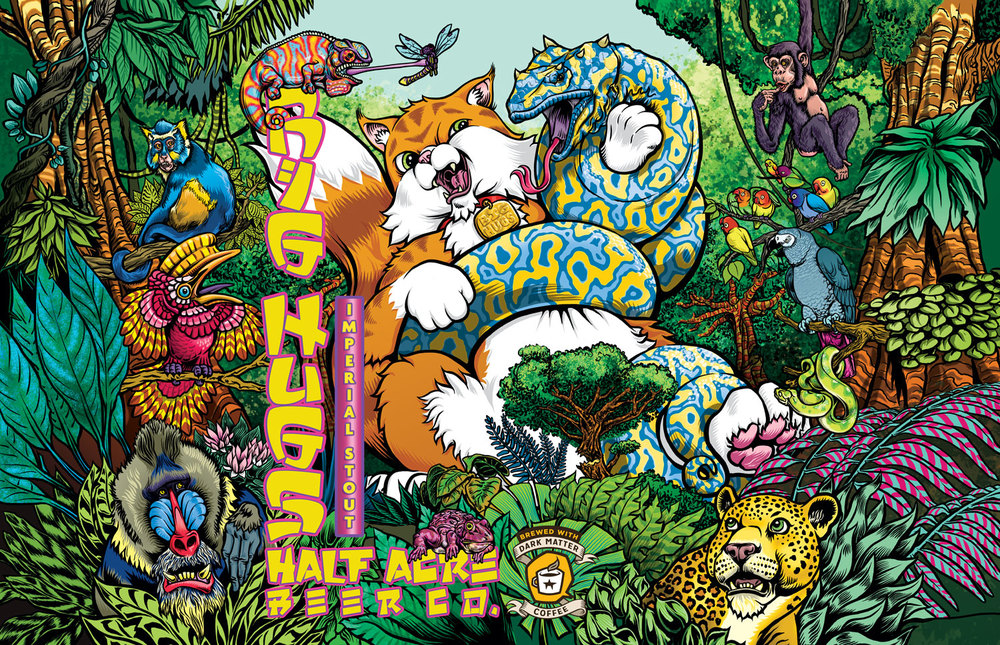 Half Acre Big Hugs
A Chicago brewery that embraces their imaging with same youthful vibrancy that they bring to their beers. Half Acre’s approach to their imaging is one of reckless abandon and they constantly change up their seasonal label designs with each year’s release.
All the Big Hugs labels have been terrific, but this year’s Russian Imperial Coffee Stout label design blew us away. These labels are hyper-colorful super and play out on a grand scale – and, oh yeah, they usually feature warrior cats (and this year it’s battling a demon python)!
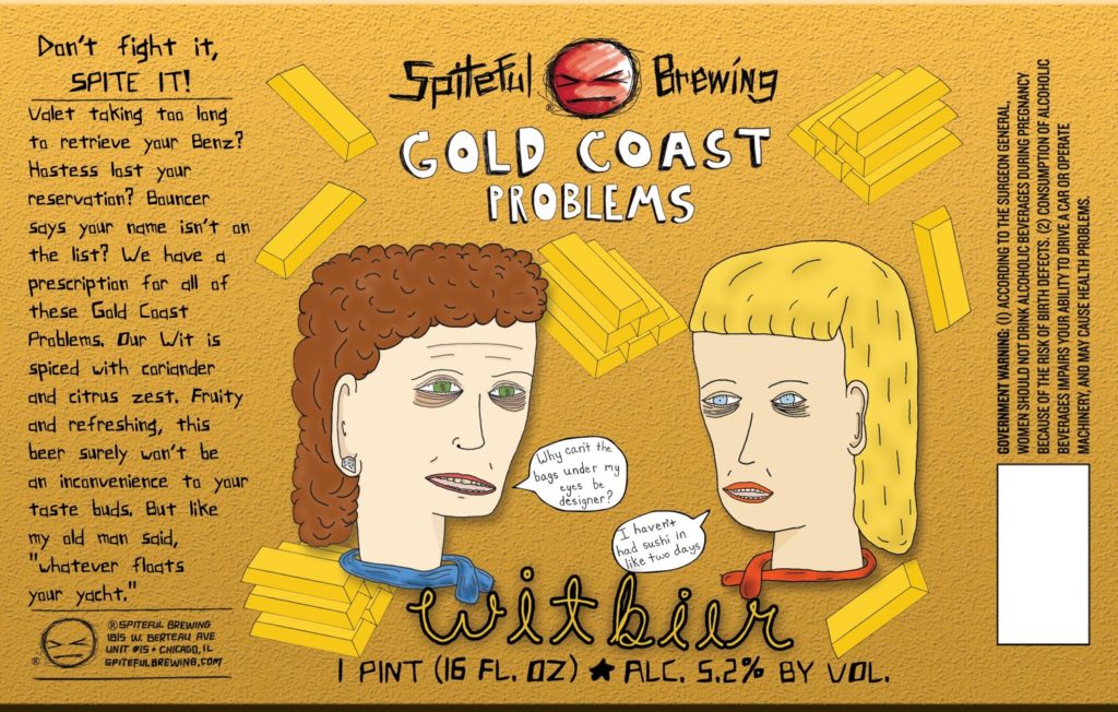 Spiteful Brewing Gold Coast Problems
Another Chicago brewery doing amazing with their imaging (and their beer!) is Spiteful Brewing and their label they’ve designed for their seasonal Witbier take’s graphic novel angst and satire to an SNL level.
Gold Coast Problems nails the issues that have besieged the prosperous housewives of Chicago’s wealthy Gold Coast community. We’re particularly enamored with the bars of gold that frame the North Shore matrons and the text to the left.
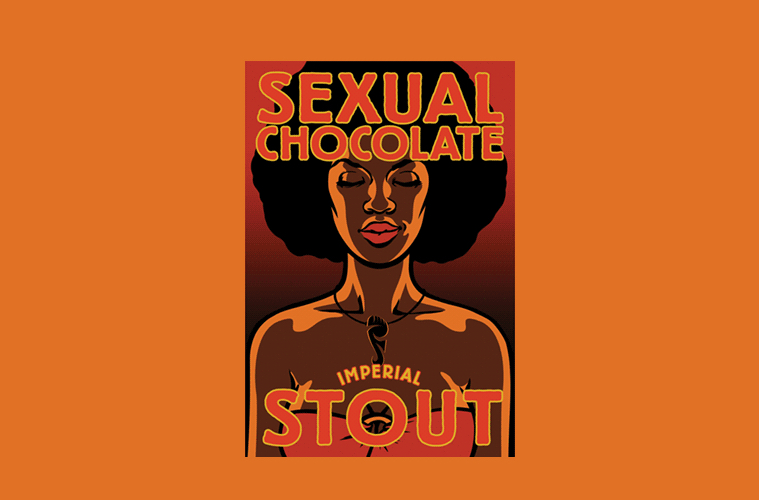 Sexual Chocolate Imperial Stout
One of craft beer’s best and most celebrated labels ever is both an ode to pure sexuality and a Marvin Gaye-like homage to late 70’s “Los Angeles Soul” poster art.
When a beer is as provocatively named as Sexual Chocolate Imperial Stout is, the label artwork needs to capture things perfectly or the concept comes off as cheap or porn-ish. North Carolina-based Foothills Brewing bravely threw the dice with both the beer’s name and its imaging and they succeeded wildly.
The orange colors and brown tones nail late afternoon sex and we love that the soul sister’s eyes were drawn closed. Brilliant!
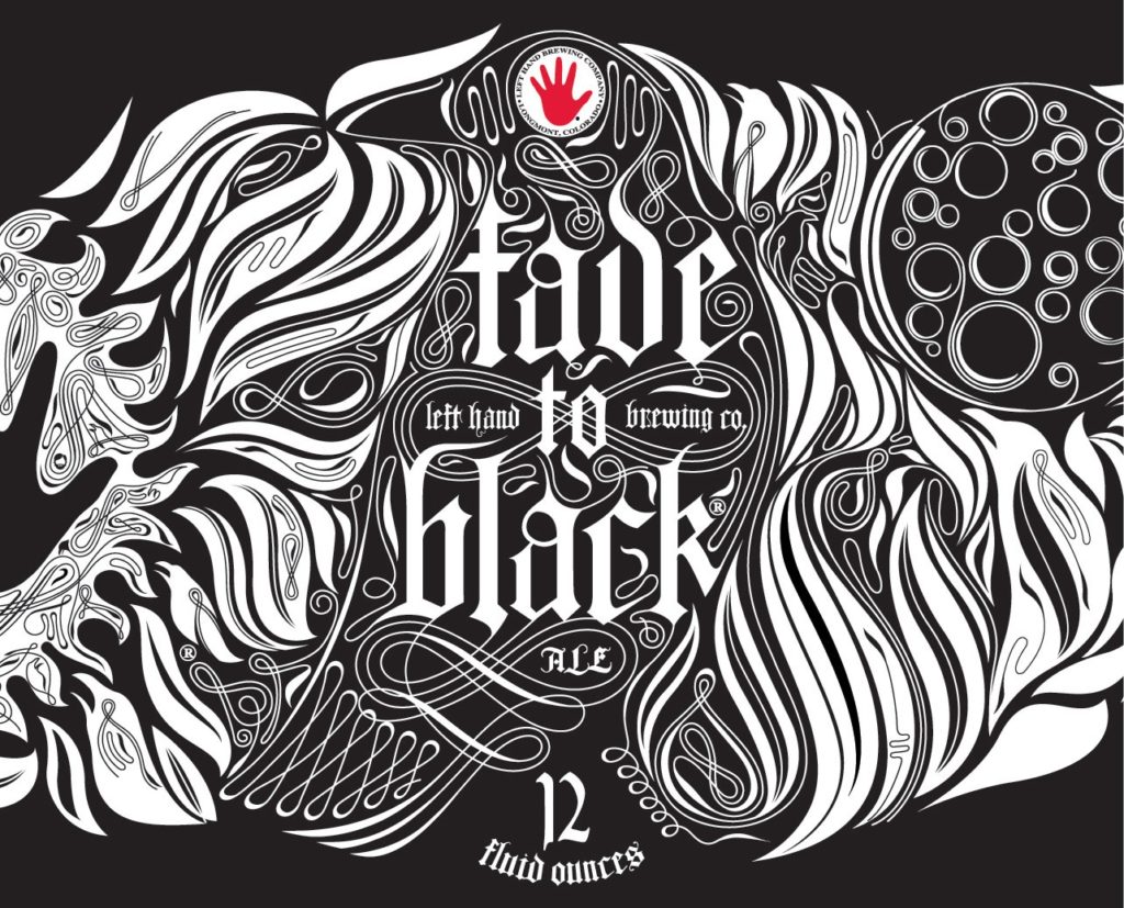 Fade To Black Vol. 1 Ale
Label artwork has always been one of Left Hand Brewing’s calling cards. They’ve done a lot of admirable work over the years and we think their Fade to Black Vol. 1 is as brilliant a label design as the award-winning Export Stout it fronts.
The Gothic black and white label design was reportedly inspired by Edgar Allen Poe’s The Raven and there are several of these birds hidden in the overall design that make for fun drinking games.
 American Craft Beer The Best Craft Beer, Breweries, Bars, Brewpubs, Beer Stores, And Restaurants Serving Serious Beer.
