 Most of us will probably admit that at some point in our lives, we took a chance on a new beer because of a sweet label design or a compelling image on the bottle or can. With no brewer there to explain the complexity of the ingredients or store representative to entice customers with samples, the decision of whether or not to purchase a particular beer at retail often depends on its label’s ability to sell itself. No stranger to the powers of label design, Jester King Craft Brewery out of Austin, Texas, knows that labels can do more than function as branding beacons enticing customers to take a second look – they can also tell a story about the beer itself.
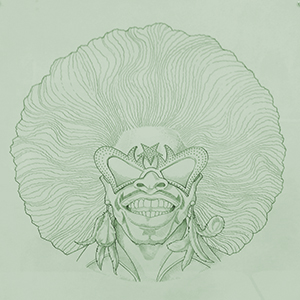
The captivating and hauntingly beautiful images that grace Jester King’s award-winning labels are the product of Josh Cockrell’s vivid imagination. A freelance artist and a dabbling homebrewer, Josh knew he had found his creative home when he fell in love with Jester King’s brewing philosophy – to express the terroir of the land around them through the creation of true-to-style unfiltered and unpasteurized farmhouse ales that rely on special yeast strains instead of additives to achieve depth and flavor complexity. Creating Jester King’s label art is Josh’s full-time job (pretty sweet, right?). But what consumers don’t realize is that there is more to his job than just sketching and scanning original drawings that characterize the brand – he’s got to live up to expectations of what’s inside the bottle.
“I have to create a character that does justice to the beer,” Josh explained at a recent Whole Foods class showcasing Jester King’s label art. “Some come to me instantly, and others plague me for very long periods of time and can take up to 2-3 months to finish.”
In his first public display of label art sketches, Josh shared the stories behind his drawings and led attendees through a tasting of five Jester King brews. In his explanation, he touched on the fact that his labels are often purposeful statements against the mainstream, and often feature societal outcasts who’ve come to grips with their differences and now revel in their individuality. We were first introduced to Das Überkind and its cousin, Das Wunderkind!, two saisons brewed using souring Lactobacillus bacteria (the same kind responsible for the tartness in yogurt) that feature the “nonconformist as a hero” motif. Character traits that might be alienating in real life become familiar and endearing when imaged through Josh’s eyes, creating the sense that the labels themselves have become living organisms that exist outside the realm of their two-dimensional habitats. And in some cases they have, in the form of a cease-and-desist letter that Jester King received after too closely depicting the image of guitarist/vocalist Abbath from the Norwegian black metal band Immortal on their Black Metal Imperial Stout label. Or in the figurative representation of Scott Roberts, the owner of the world-famous Austin-based barbeque joint The Salt Lick, as a smoke monster on the label of their Salt Lick Pecan Wood Smoked Saison.
But Josh doesn’t always stick to safe and comforting subjects – in some of his more vivid label designs, he masterfully evokes a sense of discomfort that toes the line between alluring and eccentric. The blood-splattered image of Mad Meg, depicted on the label of the brewery’s bold 9.6% ABV Mad Meg Farmhouse Provision Ale, relives the old Flemish folklore “Dull Griet” of a vengeful woman who leads an army to pillage hell and defiantly returns unscathed carrying stolen treasures from the underworld. This violent image of greed hints at the punishment that awaits you if you drink this high-gravity brew with reckless abandon.
The opposite of a veiled warning of overindulgence, the sessionable 3.5% Oaked Farmhouse Mild Commercial Suicide is self-depreciating in both image and name in response to the perceived market reaction for such a low-alcohol brew. Either unaware of or unconcerned with society’s criticisms, the naively unperturbed punk rocker on this brew’s label clearly isn’t interested in conforming, and his grin seems to suggest he has in fact embraced his place as an outsider. This theme of defiantly rocking to your own rhythm takes the form of a transvestite furry bear-man that graces the bottle of Bonnie the Rare, a 3.7% ABV Berliner Weisse. It’s Jester King’s response to mainstream beer media that’s overrun with pictures of bikini-clad models – a shocking yet weirdly refreshing jab at the sex-driven imagery embedded in macrobrewed drinking culture.
As rich in their backstory as they are in design, the unique foil-based labels are also easy to remove for collectability. The use of foil is meant to distinctively catch the eye as well as mimic farmhouse/Victorian style décor elements that often featured ornate gilding. If the images and easy-to-remove nature of the labels aren’t enough of a draw already, one of the newest Jester King brews yet to be released will feature an original watercolor design, with some of the color coming from the use of the actual brew as a painting agent. Although Josh is in possession of all his original sketches, plans are in the works to make prints and posters of his art available for purchase in the near future.
No matter how you feel about the images or statements on the labels at the end of the day, you can’t deny the attention to detail and hours of thought put into the elaborate presentation wrapped around each Jester King beer. So the next time you’re in Texas, take a glance at our local beer selection – I guarantee you’ll be hauntingly drawn to the expressive faces beckoning you on a signature Jester King bomber.
 American Craft Beer The Best Craft Beer, Breweries, Bars, Brewpubs, Beer Stores, And Restaurants Serving Serious Beer.
